The carousel can be defined as a circular conveyor or revolving tray that is used to showcase or store products. And, a carousel pattern can be used in web designs, however, most of the people don’t consider them as an ongoing trend. There are several articles like “Should I use Carousel” available on the Internet that debate for its usefulness in designs.

While considering the online businesses, it can be observed that mobile eCommerce has become a burgeoning industry with its rapidly increasing popularity and demand in the market. This is because, it allows online retailers to efficiently reach a wider group of audiences while facilitating consumers to conveniently shop as and when desired via their handy devices. If you are associated with the m-commerce website development, it would be worth to kick around and uncover the impact of implementing carousels in m-commerce solution beforehand.
Let’s delve deep into the carousel patterns and understand whether implementing them can leverage your business or not.
Implementing Carousels in mobile eCommerce solutions
A well designed carousel helps epitomize the marketing info on a home page. However, while designing for mobiles, one of the major concerns is managing the content over the screen real estate of targeted devices. Thus, one must balance the content density according to the available screen size.
Carousels help augment the density of displayed info, so that readers can conveniently go through the content without scrolling down the page. It lends an intuitive visual appeal and helps grab viewer’s attention to the products. This can further add to your conversions and sales.
To ensure a smooth and consistent performance, it is advisable to incorporate only one carousel on a page. Multiple carousels can ruin the look and feel of your mobile eCommerce solution by creating a cluttered interface. It can be best implemented on pages that offer product details, image gallery, or some marketing info. While accessing such carousel patterns, users can simply swipe to view more images or info.
Upsides of integrating Carousals
Using carousels can enhance the usability of a site. Let’s throw some light on the topic and decipher how they can improve your eCommerce business.
An easily accessible carousal can lend a great UX and thus benefit your eCommerce business.
If you are integrating a carousal pattern in your design, it is imperative to ensure that it is working flawlessly. Your users must be able to seamlessly transit to the next slide and thus, interact with your website with a flair. Moreover, you can make them effective and intuitive enough to catch your visitors attention and encourage them to make a purchase.
Analytics say that over 70% of users interact with carousels at least once, while around a quarter of users especially zoom in to interact with carousels.
Zooming in to view something indicates the curiosity of viewers to fetch more info. With around a quarter of users directly accessing the carousels to grab insights about a product increase the probability of conversions. Similarly, if more than 70% of users are simply advancing the carousel, this can also benefit your business. Because, you never know if a viewer will like to purchase something while going through the products in the carousel at a glance.
Less number of users directly access the second slide while the majority of them move from the second slide to the third slide.
It has been observed from the stats and analytics reports that accessing the carousels via different controls (like tapping on arrows, swipe, to name a few) generate different results for the likeliness of user interaction. But, it can be said that users are moving to further slides at approximately a linear rate. There are less than a quarter of users who directly access the second slide of a carousel. However, it can’t be denied that over 50% of them advance to the third slide. Furthermore, It can also be observed that the majority of direct access occur on the first slide of a carousel.
These are a few of the noteworthy insights about implementing carousels in an eCommerce website for mobile devices. To ensure a surefire and utile carousel pattern, it is essential to keep certain design aspects in mind. Go through the aforementioned key points, these will definitely help you create a remarkable mobile website to leverage your eCommerce business.
Author Signature:
Lucie Kruger is an application developer working with Mobiers Ltd, the leading mobile application development services provider. She provides concrete information on latest technologies like iOS, Android mobile apps development.
WordPress accounts for close to 25% of the total number of websites on the World Wide Web. The figure, by any measure, is staggering.
With the exceptional set of features and capabilities that are unique to WordPress, its ever growing popularity is hardly any surprise. However, as with any massively popular entity, WordPress draws a lot of prying eyes from those with malicious intentions. Hackers always have WordPress websites as their prime targets, and unsurprisingly so. And to put it quite frankly, there are loopholes for them to explore.
A typical WordPress-based website contains features installed not just via the default setup, but also via plugins, the basic theme and other sources. So, there is not a single, authorized source that is feeding a WordPress website. There are multiple third party sources, and that’s where the security threats emanate from.
When you are running a TLS enabled website, you need to be extra cautious and be certain that all the content loaded on the site is coming from a trusted and secure source. As a result of the security threats, the web browsers may also start giving out the mixed content issue, or in worse case scenario, block the website altogether.
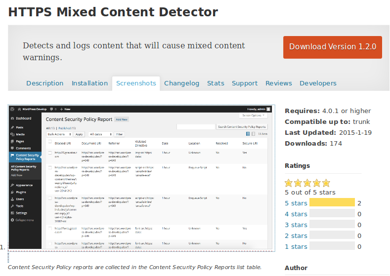
Now, to deal precisely with such an issue, we have a handful of plugins out which, the HTTPS Mixed Content Detector unarguably comes across as the best. This plugin does the task of identifying all the origins of the mixed content warnings.
The HTTPS Mixed Content Detector plugin can easily searched and installed, and once that is done, as an admin, you can see various options appearing the dashboard. All the unsecured assets are generated as a part of the list and you can examine all these assets closely. Following that, you can replace the unsecured assets with the secure ones.
There is a straightforward way to how this plugin works basically. When the admin of the site is loading the site, the plugin starts logging the nonsecure items. Carefully analyzing the log will help you gain an in-depth insight into what’s causing the errors from showing up and how you can deal with all the warnings.
How HTTPS Mixed Content Detector Plugin Works
At the very core of the HTTPS Mixed Content Detector plugin is the Content-Security-Policy-Report-Only header. This header performs the job of detecting the assets coming from authentic or suspicious sources. So, when the asset from a suspicious source does drop in, the header generates an alert by setting a report only content policy. Or, you can set a report-uri through the header that will perform the job of notifying you every time suspicious content encountered. With our plugin, a special URL represents this notification sent to you, and it is sent to you at every instance of the content violation. As the URL gets pinged, the logging of content violation will take place. And this log can be viewed as and when you get time to do so. As the Content-Security-Policy-Report-Only header is already in place, the diverse items will be allowed the entry unless the browser settings block out the assets which are already logged. And among those items, those that are unsecure will be promptly detected and you will be notified about the same. Even before the TLS is implemented on the site, the deployment of this plugin will take place. And therefore, it ensures that all the security threatening items are promptly identified and dealt with before they go on t affect the website’s performance in any negative manner.
What Part Does the Content Security Policy Play
To begin with, all the assets coming in from resources like “http://”, instead of “https://” are taken to be as security risks. Now, this is not a failsafe way to ensure security since not all security-threatening assets are logged.
This is where the Content Security Policy comes into play as it creates a shield around the wall to keep the vulnerabilities at bay. It is the browser that is responsible for monitoring the content and log the content that violates the security parameters.
You must keep it in mind that it’s not only the risk of losing your data that should compel you to protect your site, but it is also the fear of search engines penalizing you for your more than apparent security threats that should really make you sit up and take notice.
About the Author:
A seasoned web developer, Amanda Cline has extended her expertise to blogging as she writes elaborate and insightful articles around various pertinent web technologies. If you need to hire PHP developer then simply get in touch with Amanda via Twitter or Facebook. Currently, she is working with Xicom Technologies Ltd – offshore web development Company.
The inevitable meteoric rise in the mobile industry since last decade has revolutionized businesses of almost all sectors. This has greatly impacted the user behavior as it can be observed that most of the users prefer their mobile devices over desktop to access the Internet. In fact, the analytics have depicted that a whopping number of people is exclusively dependent on their mobile devices (which means they don’t use desktop). These colossal users will most probably include your partners, business associates, suppliers and most importantly your consumers.

With such an extensive use of mobile devices across the globe, and since, Google considers mobile-friendly sites in its ranking algorithm, the design approaches like “mobile only” and “mobile-first” designs have gained great momentum. For this reason, it has become more than imperative to streamline your mobile presence with an optimal design. And, this can be done more efficiently by stepping into your mobile user’s shoes while considering the latest trends in the burgeoning mobile industry.
If your business doesn’t embrace a peculiar and impressive mobile design, some of your competition surely will. To help you take your mobile design strategy to the next level, here is how:
1. Support user-centric notifications.
You must define certain triggers based on user’s actions that can alert you with a notification and, thereby, facilitate you to take an appropriate action. This can be scrutinized by considering several factors, like geographic location, recent news, role in an organization, and so forth.
This can be further explained with an example. Let’s suppose that yours is a supply chain application. Now, due to certain unfavorable weather conditions, your cargo can’t be merged in transit. Thus, the state department after recording privacy in your navigation route, triggers a notification to inform you about the change in the route.
Such user-centric notifications augment proactive and instant actions. Moreover, you may also define your triggers to automatically commit an appropriate action. For instance, if there is a certain change in the route of a ship due to some adverse climatic conditions, the delay in arrival time can be automatically notified to the on-ground transportation and port.
2. Design it to meet your organizational goals in a legible fashion.
If you are endeavoring for your for business goals, your mobile solution must connect and epitomize your business data in a comprehensive manner. Since, your mobile app will create a physical extension of your enterprise, there must be a seamless connection between the app and relevant data. There must be a minimal time frame to load the data accurately and it must be showcased in an interactive and intuitive way. Furthermore, your users can be your employers or they can be your customers, thus, it is imperative to display the data while considering the different perspectives of your potential users. This can be done efficiently by streamlining your app design by indicating who your users are and what they are looking for.
3. Integrate advanced features of mobile technology.
Today, almost every mobile device supports the latest features that you can think of. The superior features (that are offered by most of the smartphones, tablets, etc.), including camera, GPS, accelerometer, microphone support, etc., can be incorporated into a mobile solution to ensure an ultimate UX with an optimal result.
4. Go Responsive
The responsive design has taken the IT world by storm. It has offered an amazing solution to deal with the proliferation of the mobile devices (featuring different screen sizes, screen resolution, platform and more), and target a gigantic mobile user base. There are several benefits for creating a responsive business app or website. Here are a few of them.
- A responsive design ensures a consistent performance across different devices, by integrating navigation and displaying the content in a similar fashion.
- It offers a cost-effective solution to efficiently reach a plethora of devices with a single design. No additional effort and cost is required to manage all the versions of your business solution.
- If your business solution will embrace an optimal responsive design, it can efficiently meet the needs of your desktop as well as mobile users. This will definitely augment your potential customer base and thus, help leverage your business.
- It facilitates complete access to the entire content.
A well developed responsive design can create a tactile and perceptive look and feel of your business solution. This will ultimately entice your potential users and help keep them engaged and therefore, drive greater conversions and profits.
5. Seek Advantage Of Tools To Design Your Mobile solution.
With the rapid advancement in the technology and burgeoning mobile industry, today, there are several resourceful, proficient tools available in the market; you may use LiveView, Sketch, to name a few. Therefore, to make sure that designing a mobile version is not a headache for your organization, you must implement the latest technology for creating an effective and noteworthy design.
6. Determine your target audience and devices that they use.
The behavior of your potential users must be considered while designing a business solution. The way your users are using their devices and what kind of devices are preferred must be considered while designing for businesses. It will help you better tailor your design to meet your user’s expectation and target them with an intriguing design to ensure an easily accessible business solution.
7. Facilitate instantaneous interactions.
By fetching real-time feedbacks from users and instantly responding to them, you can generate a sure-fire business solution. The rapid interaction between a business and its consumers is a critical aspect that demands utmost precision. To attain a result-driven solution, it is recommended to design in a way that allows you to retrieve and address the feedbacks of your potential consumers within a field that can be easily modified.
Let’s wrap it up
Most importantly, there is not a particular approach for every business that can optimize mobile designs. Thus, it is essential to kick around and seek an ideal strategy that can work perfect for your business needs. This is why, it is always advisable to keep your prime business goals in mind while contemplating your mobile designs. Furthermore, since, it is anticipated that mobile will hold the reins in the future, an optimal mobile design will definitely ensure a sustainable business solution.
About the author:
Addison Cohen is an application developer for Appsted Ltd, an mobile application development services provider. He loves sharing latest information on Android, iOS or other mobile technology.
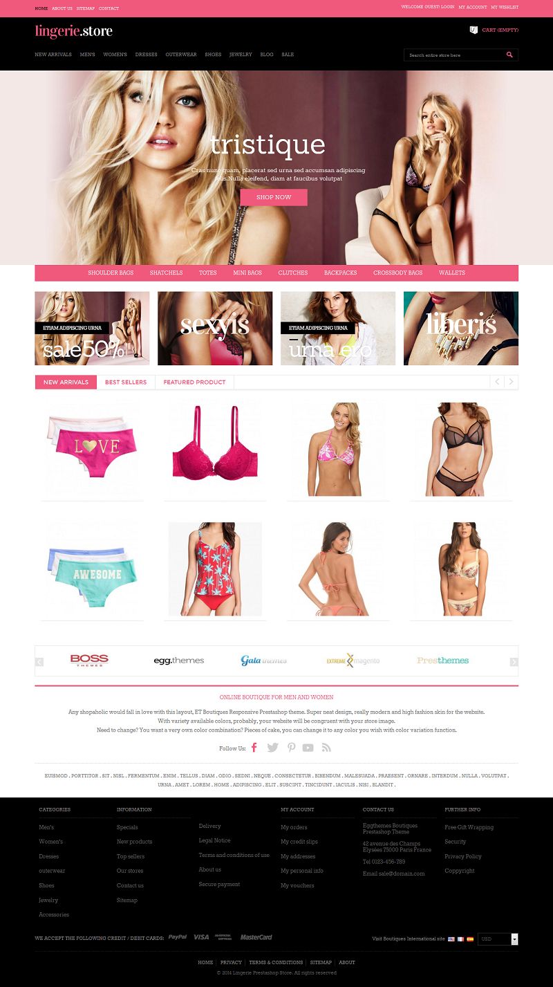
Lingerie is a responsive and uncluttered PrestaShop theme designed for selling sexy babydolls, slips, garters, corsets, teddies and more fashion items. Large fonts are legible and easy to read. The content area contains two section with products placed in four columns. Navigation is realized via main and footer menus. Search bar is also available on top of the page.
Features:
- Responsive Design – Width changed on breakpoints
- Mega menu with many type dropdown option
- Revolution Slideshow to show beautiful slideshow image and caption with many effect
- Quick View for each product in the homepage and category page
- Custom message Add to cart with Popup view
- Theme Editor – Powerful to setup custom color and custom font
- Products Grid and List view
- Blog System with support for Categories, Post, Comment, Tags, Related Posts, Related Products, Friendly URL
- Static Blocks – Many banner and custom link, custom html text
- Support ajax search and instant search
- Products Filter
- Featured Products
- Easy install theme by module theme importer
- Mini dropdown cart
- News letter
- Social icon network
- One page checkout
- Product Review
- Product Comment
- Product Accessories
- Zoom and Light box product thumbnail
- Support module layered navigation block.
- Life-time free update
Price: From $100.00
View Demo & Buy Now
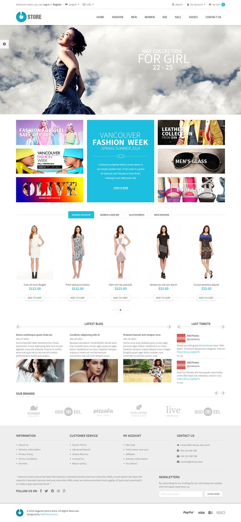
SNS Ostore is a responsive Magento multipurpose theme based on Flat Long Shadow design to represent more clean and elegant feel. This theme comes with a very unique and attractive design with powerful set of features including 6+ demo home pages, power admin, cool effects, easy to customize options and much more.
Features:
- 6+ Home pages layout
- 6+ Colors
- Responsive Design
- 2 layout type(Full width, Boxed)
- Support cpanel, Admin config
- Support Sticky for menu. Sticky left/right for block content, block link
- Amazing menu
- Responsvie menu: Sidebar, Collapse
- SNS Ajax cart: Ajax add to cart, compare, wishlish
- SNS Ajax Filter: Layer Navigation Ajax, Slider price Ajax, Toolbar product Ajax
- Other Extensions: SNS Revolution Slider, SNS Slider, SNS Quickview, SNS Twitter, SNS Facebook
- Upsell products slider
- Elevate Zoom, Thumbnail slider, Fancybox
- Brand slider logo
- Support style for blog page(AW Blog), contact page
- Support Magento Community Edition 1.7.x, 1.8.x and 1.9.x
- Integrated Twitter Bootstraps
- Integrated Google Fonts, Integrated font FontAwesome
- Using html5, css3, lesscss
- Cross-browser: IE 8+, Safari, Mozilla Firefox, Opera 9+ and Chrome
- W3C XHTML Transitional Valid
- Quickstart including sample data, easy to install
- PSDs file supplied
- User Guide Documentation html file
Price: $89.00
View Demo Download Now
Note: All the templates and extensions listed in this site are from their respective developers and all support requests should be sent directly to the developers. We do not provide support for any of the templates or extensions listed in this site. We just make some revenue if you purchase any of the product through the link from our site.