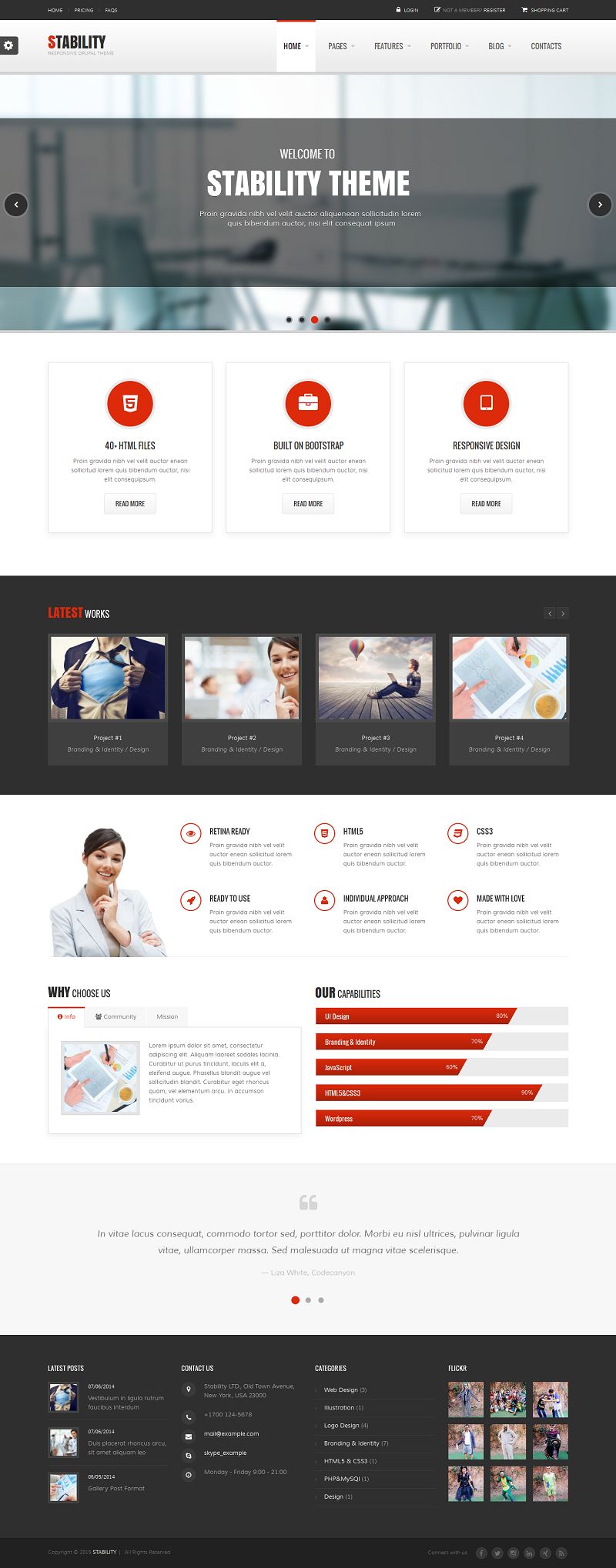
Stability is a clean, modern and responsive Drupal theme suitable for many purposes including corporate business sites, ecommerce sites, a creative agency or a portfolio projects. This theme includes a layout builder, Visual Shortcodes, 8 predefined color schemes, premium slider, 7 homepage layouts, 4 portfolio layouts, 4 blog pages, coming soon page, contact pages and more.
Features:
- 100% Responsive Layout Design
- HTML5 and CSS3
- Bootstrap 3.1.1
- Drag & Drop Visual Layout Builder
- Drag & Drop Visual Shortcodes
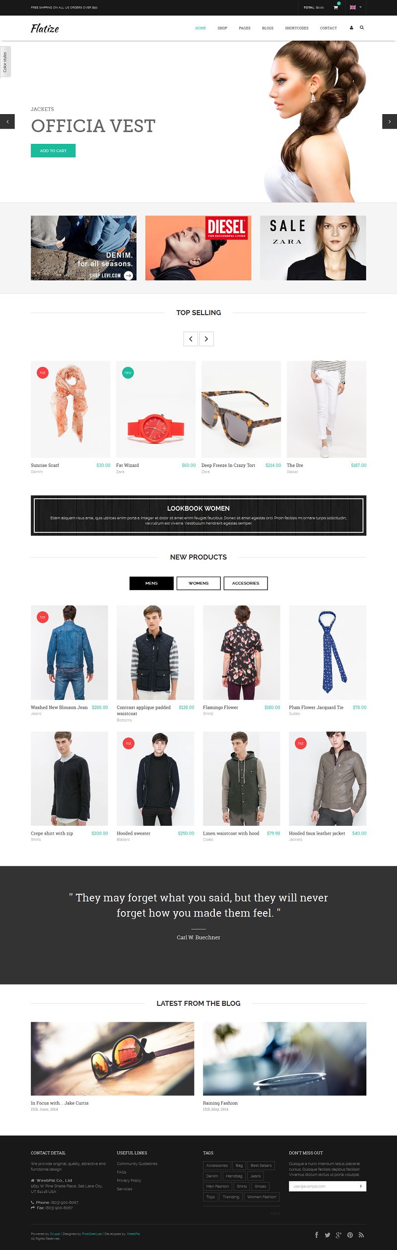
- Ubercart Shop
- Premium Mega Slider included.
- Fast and Easy Support.
- One Page version
- 8 predefined color schemes and easy to create your own
- CSS3 Animation
- Flickr Widget
- 600+ Google Fonts Usable
- 403 Font Awesome Icons Included
- 7 Home Layouts
- 6 Headers
- 5 Page Headers
- 5 Footers
- 4 Portfolio Layouts
- 4 Blog Layouts
- Forum
- Coming Soon page included
- 4 Pricing Tables
- Google Maps integration
- Contact Form
- 18 Layered PSD included
- Documentation
Price: $48.00
View Demo Download Now
The carousel can be defined as a circular conveyor or revolving tray that is used to showcase or store products. And, a carousel pattern can be used in web designs, however, most of the people don’t consider them as an ongoing trend. There are several articles like “Should I use Carousel” available on the Internet that debate for its usefulness in designs.
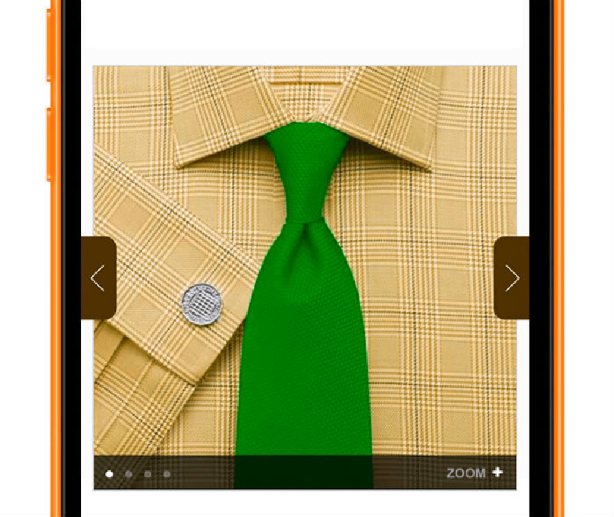
While considering the online businesses, it can be observed that mobile eCommerce has become a burgeoning industry with its rapidly increasing popularity and demand in the market. This is because, it allows online retailers to efficiently reach a wider group of audiences while facilitating consumers to conveniently shop as and when desired via their handy devices. If you are associated with the m-commerce website development, it would be worth to kick around and uncover the impact of implementing carousels in m-commerce solution beforehand.
Let’s delve deep into the carousel patterns and understand whether implementing them can leverage your business or not.
Implementing Carousels in mobile eCommerce solutions
A well designed carousel helps epitomize the marketing info on a home page. However, while designing for mobiles, one of the major concerns is managing the content over the screen real estate of targeted devices. Thus, one must balance the content density according to the available screen size.
Carousels help augment the density of displayed info, so that readers can conveniently go through the content without scrolling down the page. It lends an intuitive visual appeal and helps grab viewer’s attention to the products. This can further add to your conversions and sales.
To ensure a smooth and consistent performance, it is advisable to incorporate only one carousel on a page. Multiple carousels can ruin the look and feel of your mobile eCommerce solution by creating a cluttered interface. It can be best implemented on pages that offer product details, image gallery, or some marketing info. While accessing such carousel patterns, users can simply swipe to view more images or info.
Upsides of integrating Carousals
Using carousels can enhance the usability of a site. Let’s throw some light on the topic and decipher how they can improve your eCommerce business.
An easily accessible carousal can lend a great UX and thus benefit your eCommerce business.
If you are integrating a carousal pattern in your design, it is imperative to ensure that it is working flawlessly. Your users must be able to seamlessly transit to the next slide and thus, interact with your website with a flair. Moreover, you can make them effective and intuitive enough to catch your visitors attention and encourage them to make a purchase.
Analytics say that over 70% of users interact with carousels at least once, while around a quarter of users especially zoom in to interact with carousels.
Zooming in to view something indicates the curiosity of viewers to fetch more info. With around a quarter of users directly accessing the carousels to grab insights about a product increase the probability of conversions. Similarly, if more than 70% of users are simply advancing the carousel, this can also benefit your business. Because, you never know if a viewer will like to purchase something while going through the products in the carousel at a glance.
Less number of users directly access the second slide while the majority of them move from the second slide to the third slide.
It has been observed from the stats and analytics reports that accessing the carousels via different controls (like tapping on arrows, swipe, to name a few) generate different results for the likeliness of user interaction. But, it can be said that users are moving to further slides at approximately a linear rate. There are less than a quarter of users who directly access the second slide of a carousel. However, it can’t be denied that over 50% of them advance to the third slide. Furthermore, It can also be observed that the majority of direct access occur on the first slide of a carousel.
These are a few of the noteworthy insights about implementing carousels in an eCommerce website for mobile devices. To ensure a surefire and utile carousel pattern, it is essential to keep certain design aspects in mind. Go through the aforementioned key points, these will definitely help you create a remarkable mobile website to leverage your eCommerce business.
Author Signature:
Lucie Kruger is an application developer working with Mobiers Ltd, the leading mobile application development services provider. She provides concrete information on latest technologies like iOS, Android mobile apps development.